Resort Website Redesign
Company:
Salinas Resorts
My Role:
UX/UI Designer
Team:
1 Product Owner, 2 front-end developers, and 2 back-end developers
Situation
In 2013, Resorts Salinas, one of the best-rated all-inclusive resorts in Brazil, was struggling with a severe problem: customers who visited the Salinas Maragogi and Salinas Maceió websites were confused and mistakenly booked accommodation at one of the hotels, thinking they were booking it at the other. This problem generated frustration for the customers and a series of inconveniences for the customers and also for the resort.
Tasks and Challenges
How might we design a clearer navigation system to differentiate between Salinas Maragogi and Salinas Maceió, ensuring customers can easily identify and select their desired resort?
How might we create a more intuitive booking process that reduces confusion and prevents customers from mistakenly booking the wrong resort?
How might we improve the overall user experience on the website to enhance customer satisfaction and reduce frustration during the booking process?
How might we implement visual cues or branding elements that distinctly represent each resort, helping customers to distinguish between the two easily?
Actions I took
Worked with stakeholders to understand customer frustrations, identify business needs, and explain how the business differentiates itself from the competition.
Analyzed the sitemap to identify opportunities to improve the architecture information, aiming to simplify the navigation.
Sketched initial ideas and crafted wireframes to collect feedback from stakeholders.
Ran usability testing to get feedback from users.
Created a high-fidelity interface for both Resorts.
Presented the project to the stakeholders.
Worked closely with the developers, supporting them during implementation.
Proposed Solutions
Create a website for each resort, allowing users to change the resorts anytime.
Stablish different colors for the interface of each of the resorts: orange for Salinas Maragogi and blue for Salinas Maceió.
Create an initial page allowing users to select the resort they want to access.
Showcasing the natural beauty of the beaches of Maragogi and Maceió, the resort’s structure, activities, and all-inclusive system through an immersive navigation full of pictures of families having fun.
The home page of each resort was built inspired by the sales speech, presenting the resort concept of being 'complete'.
Straightforward menu navigation based on customers' interests: resort structure, accommodations, all-inclusive system, fun, services, the destination, and special deals.
Website Recording
Results
The new website structure and architecture information were welcomed by the customers, reflecting positive numbers on the website navigation.
According to Mr. Fernando Holanda, the Marketing Director at Salinas, the new website "was one of the important tools for the growth of 49% of the profit in relation to the previous year. In 2014, the occupancy rate of the apartments was 88%, an increase of 4% compared to 2013."
Salinas Resorts' website became a reference for resorts in Brazil, and competitors copied many design solutions to improve their results.
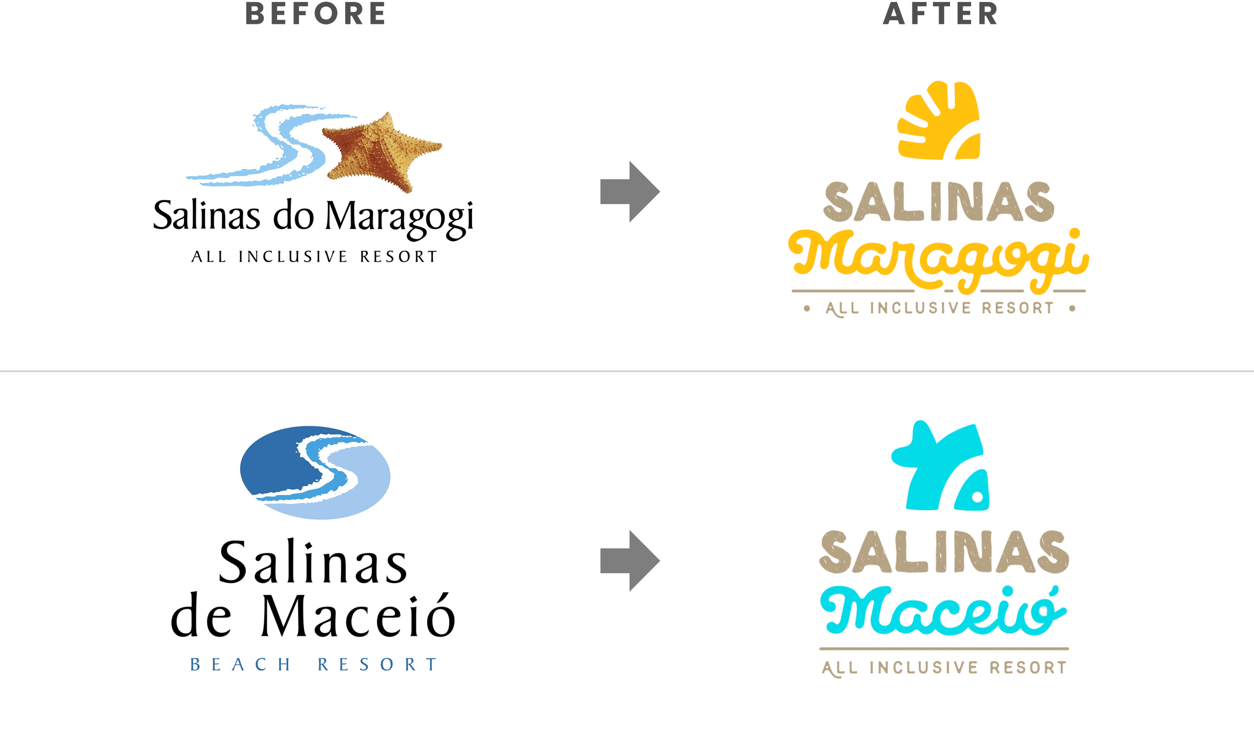
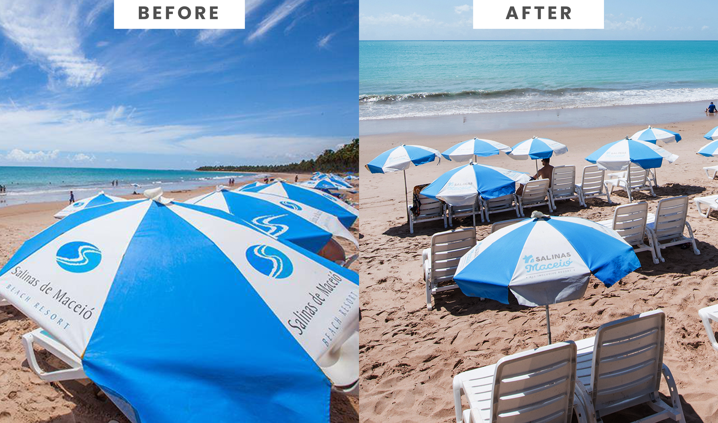
The solution of identifying the resorts with different colors was so successful that it became strategic for Resorts Salinas. In 2016, the company underwent a rebranding process, adopting the differentiation of the resorts through orange and blue colors as a permanent part of the company's visual identity.
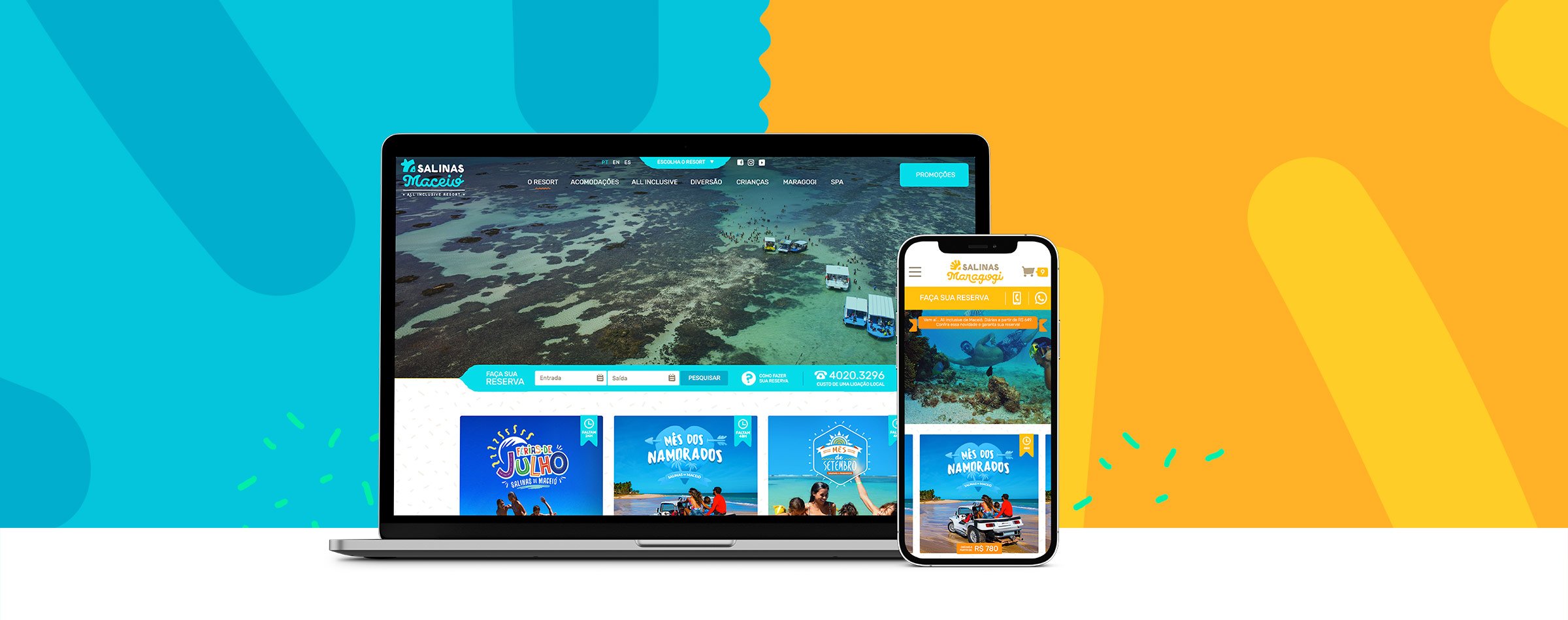
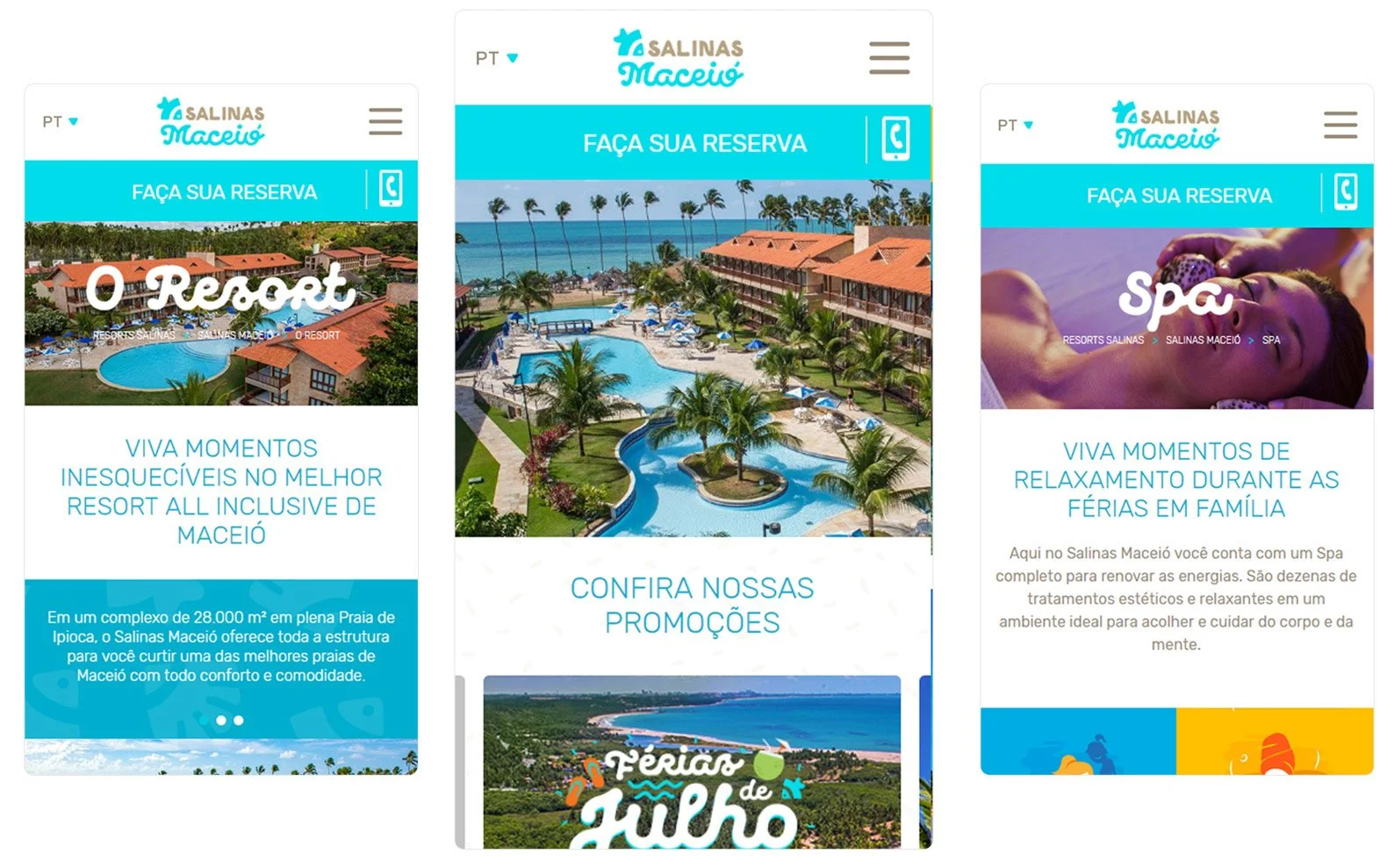
Two years later, Resorts Salinas decided to redesign its website to launch its new visual identity. The successful information architecture from the 2014 project was retained. The primary goal of the redesign was to align the design with the resort’s new branding. I was responsible for the end-to-end user experience and user interface design of the project
Learnings and insights
It was challenging to propose a completely new approach to how the business presents its products.
However, it was incredibly rewarding to see how the new website positively impacted the company’s results, becoming a key factor in achieving a 49% profit growth and a 4% increase in occupancy rates compared to the previous year.
The Resorts Salinas website redesign demonstrated the power of good design in driving business strategy and results.
New Resorts Visual Identity inspired by the UX/UI website solution of differentiating the resorts by colors:
Salinas Website Redesign (2017) to launch the new branding
In addition to positively impacting sales, the new project aimed to launch the new visual identity of the resort and provide immersive navigation impacting customers by the natural beauty and structure of the resort through videos and photos.


